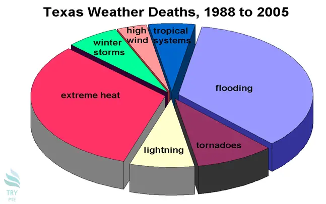
Look at the text below. In 25 seconds, please speak into the microphone and describe in detail what the graph showing. You will have 40 seconds to give your response.

This graph shows the information about Texas weather deaths from 1988 to 2005. To begin with, we can see that there are categories in comparison which are flooding, tornadoes, lightning and so on. According to the graph, the largest proportion goes to flooding and extreme heat at 60%, while the smallest proportion goes to high wind at 10%. Last but not the least, for the rest of the categories, the number are ranging from 15% to 30%. In conclusion, this is a very useful graph and it helps to understand the death distribution.
« Previous 261 262 263 264 265 266 267 268 269 270 271 272 273 274 275 276 277 278 279 280 Next»