Look at the text below. In 25 seconds, please speak into the microphone and describe in detail what the graph showing. You will have 40 seconds to give your response.
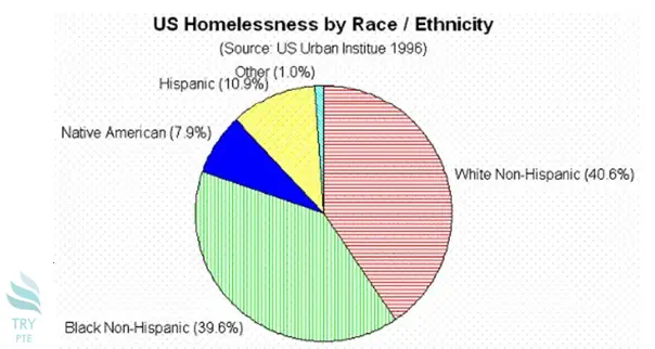
This graph shows the information about US homelessness by race and ethnicity in 1996. To begin with, we can see that there are categories in comparison which are Hispanic, white non-Hispanic, black non-Hispanic, native American. And other. According to the graph, the largest proportion goes to white non-Hispanic at 40.6%, while the smallest proportion goes to other at 1.0%. Last but not the least, for the rest of the categories, the number are ranging from 7.9% to 39.6%. In conclusion, this is a very useful graph and it helps to understand the race distribution of homelessness.
« Previous 261 262 263 264 265 266 267 268 269 270 271 272 273 274 275 276 277 278 279 280 Next»