Look at the text below. In 25 seconds, please speak into the microphone and describe in detail what the graph showing. You will have 40 seconds to give your response.
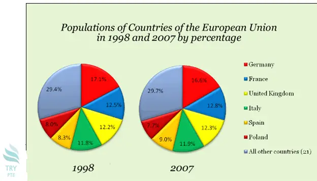
This graph shows the information about populations of countries of the European union in 1998 and 2007 by percentage. To begin with, we can see that there are categories in comparison which are Germany, France, UK, Italy, Spain, Poland and all other countries. According to the graph, in 1998, the largest proportion goes to other countries at 29.4%, while the smallest proportion goes to Germany at 8%. Last but not the least, in 2007, the largest proportion goes to other countries at 29.7%, while the smallest proportion goes to Germany at 7.7%. In conclusion, this is a very useful graph and it helps to understand the change of population distribution in Europe.
« Previous 261 262 263 264 265 266 267 268 269 270 271 272 273 274 275 276 277 278 279 280 Next»