Look at the text below. In 25 seconds, please speak into the microphone and describe in detail what the graph showing. You will have 40 seconds to give your response.
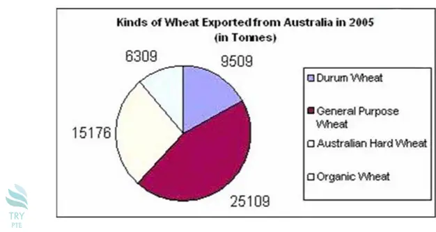
This graph shows the information about kinds of wheat exported from Australia in 2005. To begin with, we can see that there are categories in comparison which are durum wheat, general purpose wheat, Australian hard wheat and organic wheat. According to the graph, the largest proportion goes to general purpose wheat at 25109, while the smallest proportion goes to organic wheat at 6309. Last but not the least, for the rest of the categories, the number are ranging from 8509 to 15176. In conclusion, this is a very useful graph and it helps to understand that different kinds of wheat have different proportions.
.
« Previous 261 262 263 264 265 266 267 268 269 270 271 272 273 274 275 276 277 278 279 280 Next»