Look at the text below. In 25 seconds, please speak into the microphone and describe in detail what the graph showing. You will have 40 seconds to give your response.
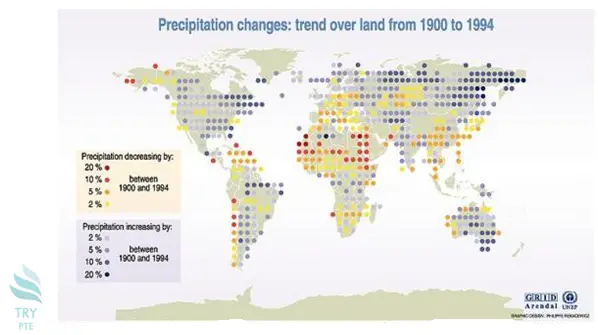
This map shows the information about the precipitation changes over lands from 1990 to 1994.To begin with, we can see that on the left of the map, wherein most areas in North America and South America, precipitation increased by 2-10%. According to the graph, as we move toward the right, however in the middle part of Africa and Europe, precipitation decreased largely by 10-20%. Last but not the least, as we move towards the right again, we notice that the precipitation in Russia increased dramatically by 10-20%.In conclusion, the change in Australia is similar to that in Russia.
« Previous 201 202 203 204 205 206 207 208 209 210 211 212 213 214 215 216 217 218 219 220 Next»