Look at the text below. In 25 seconds, please speak into the microphone and describe in detail what the graph showing. You will have 40 seconds to give your response.
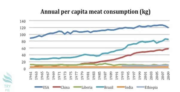
This line chart shows the information about annual per capita meat consumption in kilograms. To begin with, we can see that there is several sections in this picture, that is, USA, China, Liberia, Brazil, India and Ethiopia. According to the graph, in terms of USA, the largest number can be found in 2009 which is about 120 Kilograms while the smallest number can be found in 1961 which is about 90 Kilograms. Last but not the least, in terms of China, the largest number can be found in 2009 which is about 60 while the smallest number can be found in 1961 which is about 10. In conclusion, I think it is beneficial because it tells me annual per capita meat consumption in kilograms.
« Previous 161 162 163 164 165 166 167 168 169 170 171 172 173 174 175 176 177 178 179 180 Next»