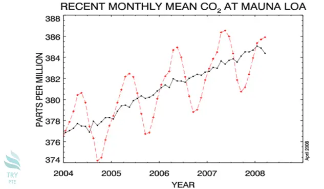
Look at the text below. In 25 seconds, please speak into the microphone and describe in detail what the graph showing. You will have 40 seconds to give your response.

This line chart shows the information about recent monthly mean CO2 at MAUNA LOA.To begin with, we can see that there are categories in comparison, which are represented in red color and black color, measured by parts per million. According to the graph, in terms of black line, it starts from 377 and finishes at 384 in 2008. Last but not the least, in terms of red line, it starts and finishes at the same point as the black line and but with fluctuations. In conclusion, it is a really useful grape about recent monthly mean CO2 at MAUNA LOA.
« Previous 121 122 123 124 125 126 127 128 129 130 131 132 133 134 135 136 137 138 139 140 Next»