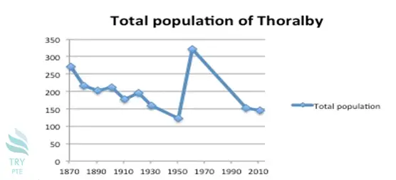
Look at the text below. In 25 seconds, please speak into the microphone and describe in detail what the graph showing. You will have 40 seconds to give your response.

This line chart vividly shows the information about total population of thoralby.To begin with, we can see that there is a fluctuated line in this picture. According to the graph, from 187❑ to 1950, the largest number can be found in 1870 which is about 270 while the smallest number can be found in 1950 which is about 110. Last but not the least, from 1950 to
2010, the largest number can be found in 1970 which is about 320. In conclusion, I think it is beneficial because it tells me the total population of thotalby.
« Previous 161 162 163 164 165 166 167 168 169 170 171 172 173 174 175 176 177 178 179 180 Next»