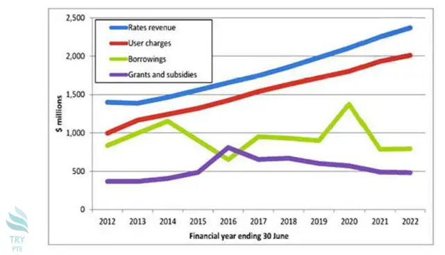
Look at the text below. In 25 seconds, please speak into the microphone and describe in detail what the graph showing. You will have 40 seconds to give your response.

This line chart vividly shows the information about an item in an overall financial report. To begin with, we can see that there are categories in comparison which are rates revenue, user charges, borrowings and grants and subsidies. According to the graph, rates revenue and user charges had constantly increased during the whole time period.Last but not the least, borrowings had fluctuated during the whole time period. In conclusion, different categories have different trends during this time period.
« Previous 141 142 143 144 145 146 147 148 149 150 151 152 153 154 155 156 157 158 159 160 Next»