Look at the text below. In 25 seconds, please speak into the microphone and describe in detail what the graph showing. You will have 40 seconds to give your response.
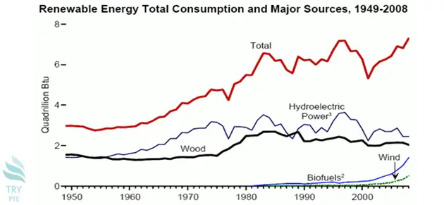
This line chart shows the information about renewable energy total consumption and major sources from 1949 to 2008.To begin with, we can see that there are categories in comparison which are total, hydroelectric power, wood , wind and biofuels.According to the graph, most of the categories had increased during this time period except that wood had decreased a bit at the beginning of the time period.Last but not the least, the use of wind and biofuels had increased dramatically since 2000.In conclusion, different categories have different trends during this time period.
« Previous 141 142 143 144 145 146 147 148 149 150 151 152 153 154 155 156 157 158 159 160 Next»