Click “Next” to practice Retell-Lecture
© 2023 Try PTE | All Right Reserved | Privacy Policy| Disclaimer
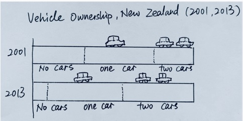
Look at the text below. In 25 seconds, please speak into the microphone and describe in detail what the graph showing. You will have 40 seconds to give your response.
« Previous 281 282 283 284 285 286 287 288 289 290 291 292 293 294 295 296 297 298 299 300 Next»
Click “Next” to practice Retell-Lecture