Look at the text below. In 25 seconds, please speak into the microphone and describe in detail what the graph showing. You will have 40 seconds to give your response.
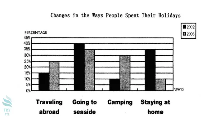
This given bar graph shows the information about changes in the ways people spent their holidays in term of percentage and ways. To begin with, we can see that there are categories in comparison which are traveling abroad, going to the seaside, camping and staying at home. According to this paragraph, in term of 2002, the largest number can be found in going to the seaside at 40%, while the smallest number can be found in camping at 10%. Last but not least, in term of 2006, the largest number can be found in going to the seaside at 35%. In conclusion, in 2006, the smallest number can be found in staying at home at 10%.
« Previous 81 82 83 84 85 86 87 88 89 90 91 92 93 94 95 96 97 98 99 100 Next »