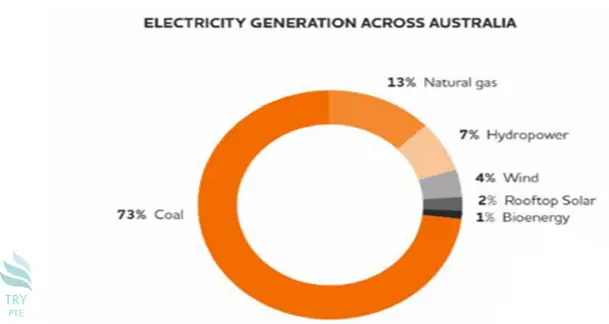
Look at the text below. In 25 seconds, please speak into the microphone and describe in detail what the graph showing. You will have 40 seconds to give your response.

This pie chart shows the information about the electricity generation across Australia. To begin with, we can see that there are categories in comparison, which are coal, natural gas, hydropower, wind, rooftop solar and bioenergy. According to the graph, the largest figure can be found in coal, which is 73%. Last but not the least, the smallest figure can be found in bioenergy, which is only 1%. In conclusion, this is a useful chart about the electricity generation across Australia.
« Previous 241 242 243 244 245 246 247 248 249 250 251 252 253 254 255 256 257 258 259 260 Next»