Look at the text below. In 25 seconds, please speak into the microphone and describe in detail what the graph showing. You will have 40 seconds to give your response.
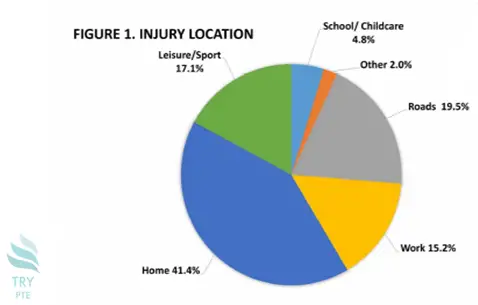
This pie chart shows the information about injury location. To begin with, we can see that there are categories in comparison, which are school or childcare, other, roads, work, home, and leisure or sport. According to the graph, the largest proportion goes to a home with the figure of 41.4%, while the smallest proportion goes to other with the figure of 2%. Last but not the least, for the rest of the categories, the numbers are ranging from 4.8% to 19.5%. In conclusion, this is a very interesting graph, and in order to get more information, we need a further research on that.
« Previous 241 242 243 244 245 246 247 248 249 250 251 252 253 254 255 256 257 258 259 260 Next»