Look at the text below. In 25 seconds, please speak into the microphone and describe in detail what the graph showing. You will have 40 seconds to give your response.
The Average Household Energy Consumption
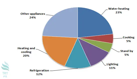
This pie chart shows the information about the average household energy consumption. To begin with, we can see that there are categories in comparison, which are water heating, cooking, standby, lighting, refrigeration, heating and cooling, and other appliances. According to the graph, the largest proportion goes to other appliances with the figure of 24%, while the smallest proportion goes to both cooking and standby with the figure of 5%. Last but not the least, for the rest of the categories, the numbers are Lighting ranging from 11% to 23%. In conclusion, households consume almost half of the total energy on heating.
« Previous 241 242 243 244 245 246 247 248 249 250 251 252 253 254 255 256 257 258 259 260 Next»